| Percent DNA Methylation at 10 Genes | |||
| Gene | Sample A | Sample B | Sample C |
|---|---|---|---|
| BRCA1 | 39.8 | 37.0 | 75.4 |
| TP53 | 28.0 | 30.2 | 62.9 |
| MLH1 | 22.3 | 21.9 | 60.6 |
| MGMT | 21.4 | 21.9 | 60.6 |
| CDKN2A | 24.9 | 31.5 | 66.4 |
| RASSF1 | 35.8 | 36.9 | 80.4 |
| APC | 26.8 | 35.0 | 69.9 |
| VHL | 39.4 | 46.2 | 78.7 |
| PTEN | 23.3 | 24.3 | 80.2 |
| RB1 | 29.2 | 34.9 | 68.7 |
Introduction
Here we explain two multivariate methods: PCA (Principal Component Analysis) or MDS (Multidimensional Scaling). They are multivariate as we commonly have real data dozens, hundreds, or thousands of numbers attached to it — gene activity levels, epigenetic measurements, etc.
What we do is to reduce all those numbers down to a simple map — usually just two or three dimensions while trying to preserve which samples are similar to each other, and which are different.
PCA: Finding the Most Informative Angle
Imagine holding an oddly shaped object — a stretched, lumpy potato — and shining a flashlight on it to cast a shadow on the wall. From some angles, the shadow is a shapeless blob that tells you almost nothing about the object. From other angles, the shadow captures the object’s real shape and spread remarkably well.
PCA is a systematic search for the best angle. It looks at all your original measurements and finds the “view” that preserves the most spread — the most real difference between samples — in as few dimensions as possible. That best angle becomes the first axis of the plot; the next-best (and unrelated) angle becomes the second axis. Those chosen angles are called principal components.
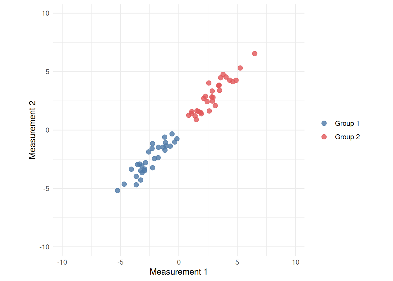
The plots below make this concrete with just two measurements. First, just the raw data: each dot is a sample with two correlated measurements — knowing one tells you a lot about the other, which is why the cloud runs diagonally instead of in a circle. Then, the two principal directions overlaid on that same cloud. Finally, PCA has simply rotated the cloud so its long direction lines up with the horizontal axis:
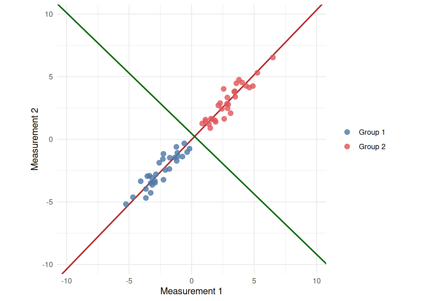
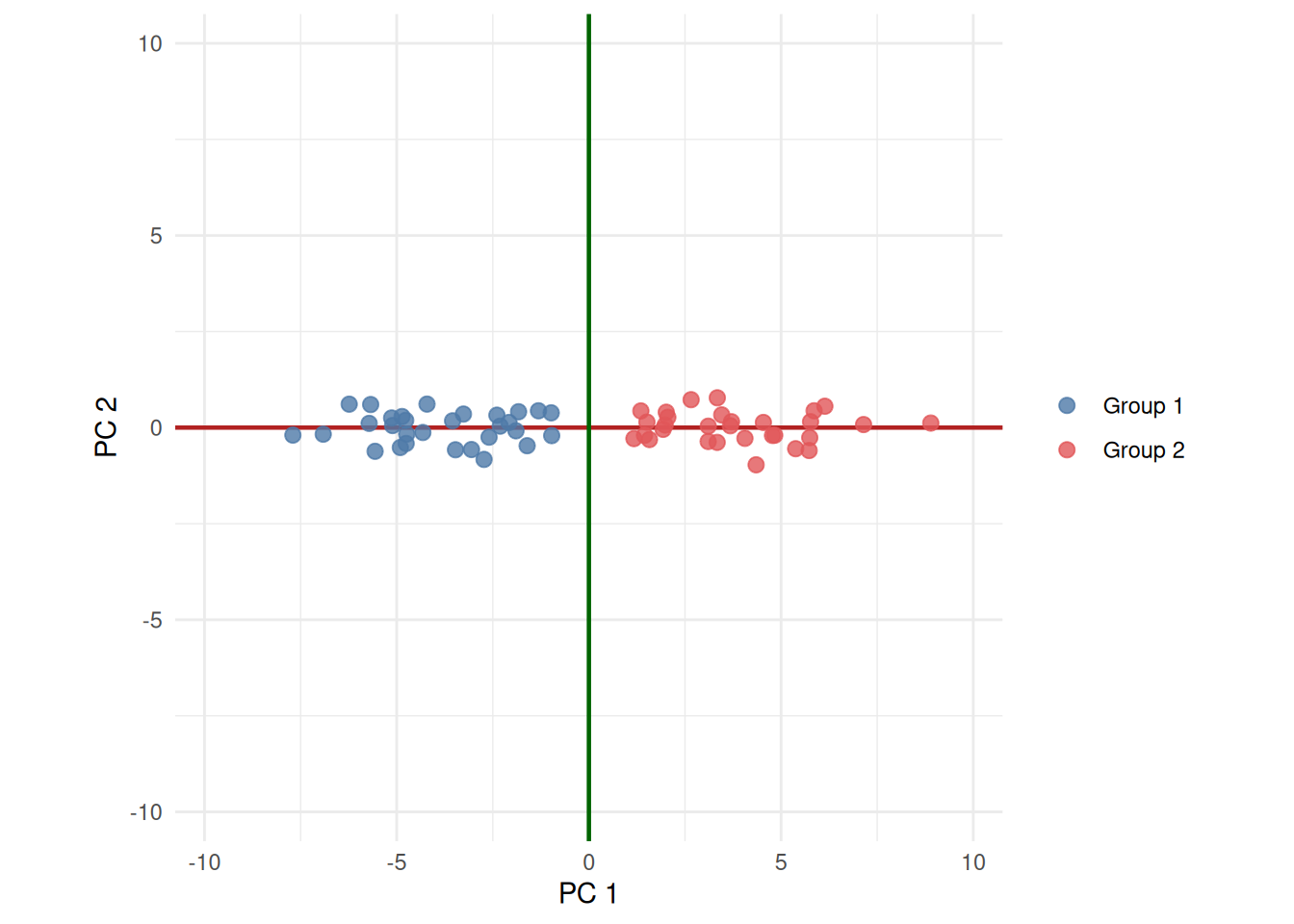
Nothing about the samples changed between those two plots — they, and the two colored lines, were only rotated. The red line (PC 1) is the same “most spread” direction in both panels; it just happens to line up with the page’s horizontal axis once PCA is done rotating.
Notice thought that, on the left we have that “Measurement 1” and “Measurement 2” meant something specific and nameable. On the right, PC 1 is some blend of both original measurements — a direction, not a thing you measured. The principal components are no longer interpretable in the same way.
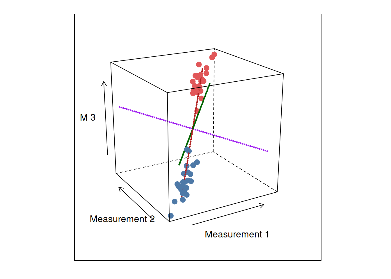
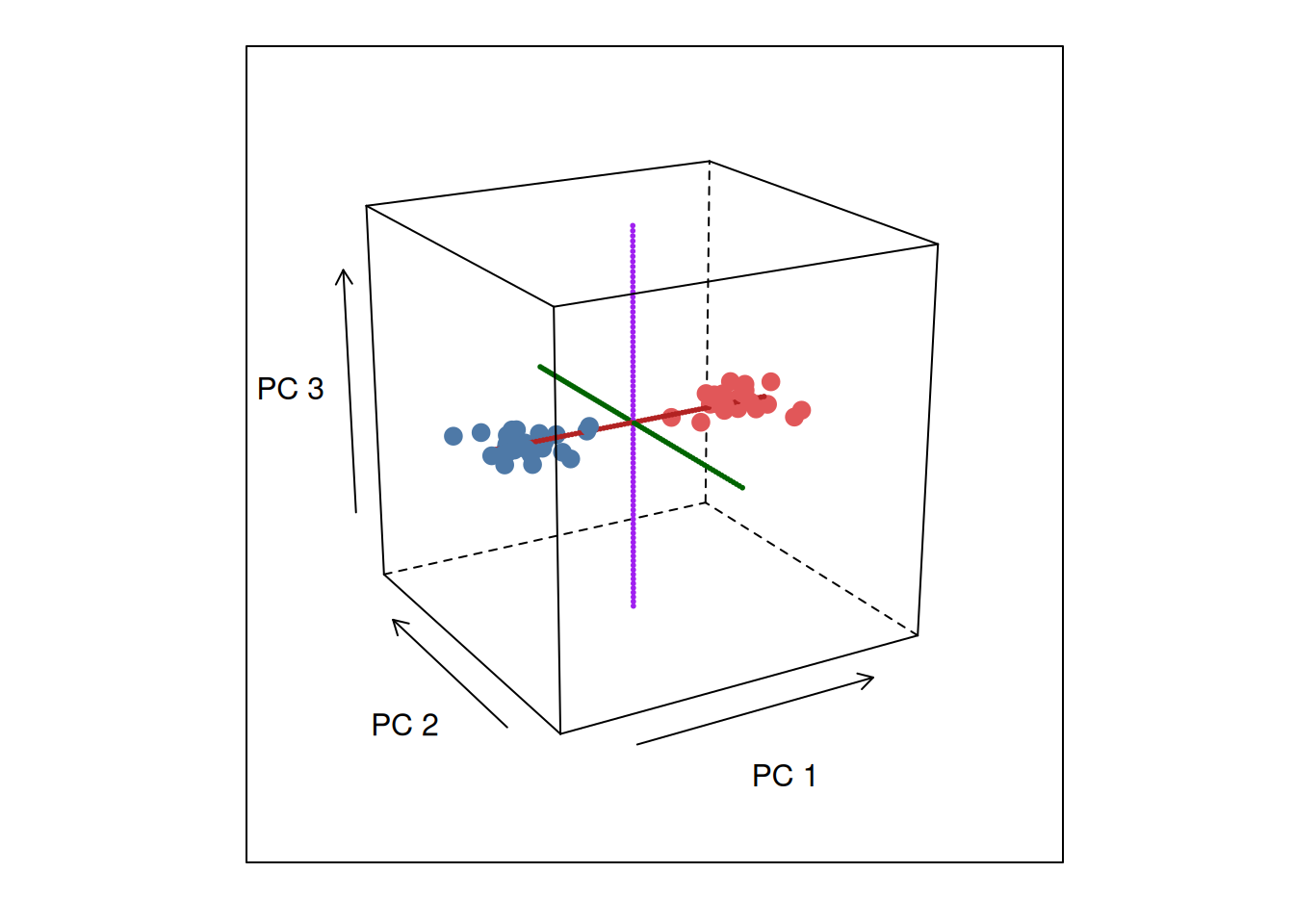
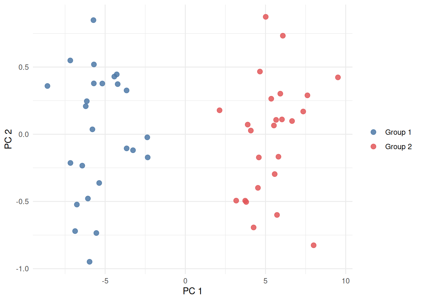
Below is another example in 3-D.
MDS: Building a Map from Distances Alone
MDS starts from a table of how different every pair of samples is from every other pair, and then searches for an arrangement of dots on a page where the distances between dots match those real differences as closely as possible. It never needs to see the original measurements — only how different each pair of samples is.
Here’s that same process end to end, with a small, realistic example. Below is percent methylation for 10 genes in 3 samples.
The first step MDS takes is to boil that whole table down to a single number per pair of samples — how different is Sample A from Sample B, overall, across all 10 genes at once?
| Overall Difference Between Samples | |||
| Sample | Sample A | Sample B | Sample C |
|---|---|---|---|
| Sample A | 0.0 | 14.3 | 131.9 |
| Sample B | 14.3 | 0.0 | 123.3 |
| Sample C | 131.9 | 123.3 | 0.0 |
This table is then transformed into a similarity table, where 0% corresponds to the most different, and 100% to identical:
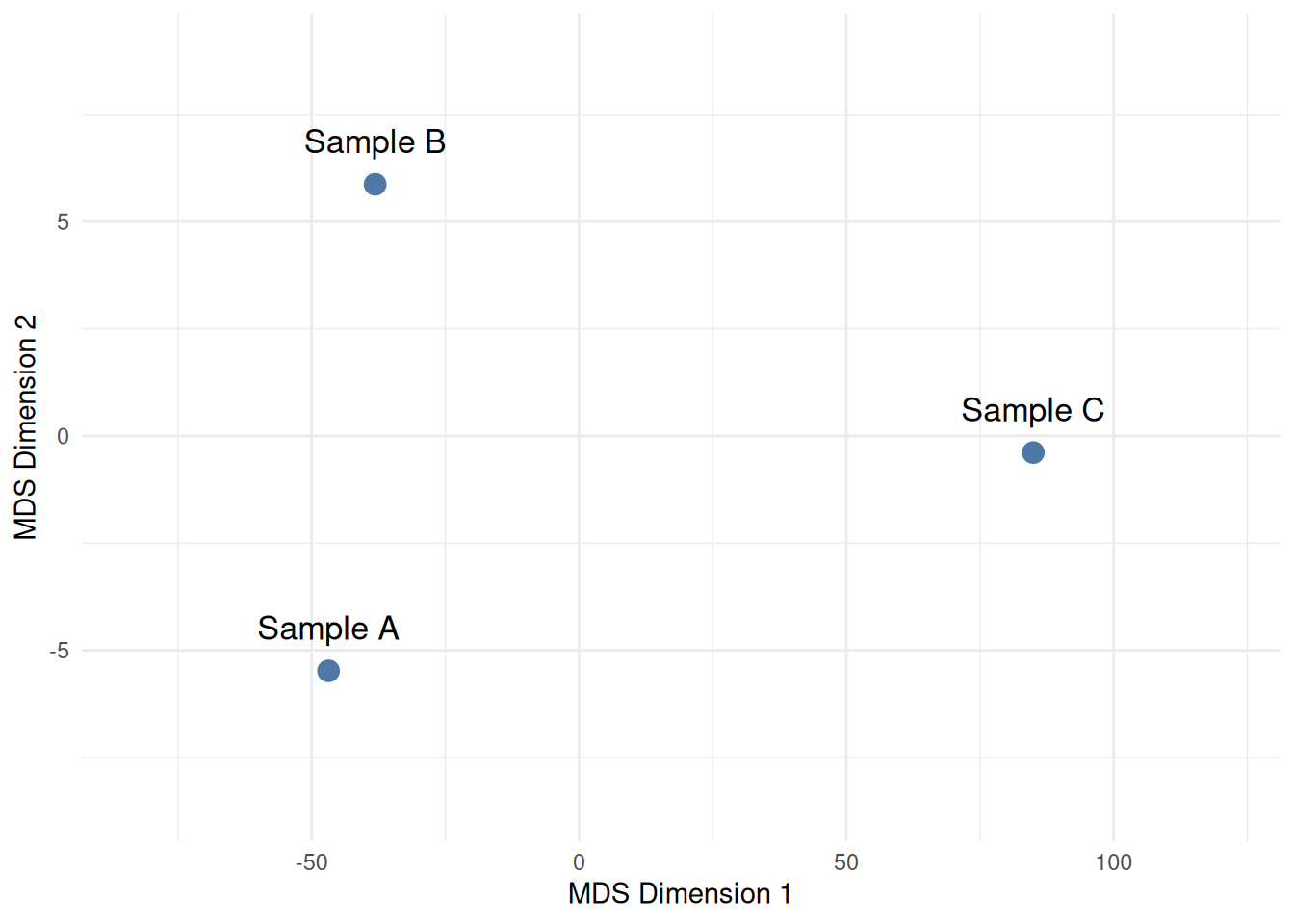
We then apply the same PCA approach to obtain the 2D graph:
So What’s the Actual Difference?
- PCA starts from the original measurements and looks for the directions that show the most variation between samples.
- MDS starts from a table of pairwise differences and tries to reproduce those differences as distances 2D.
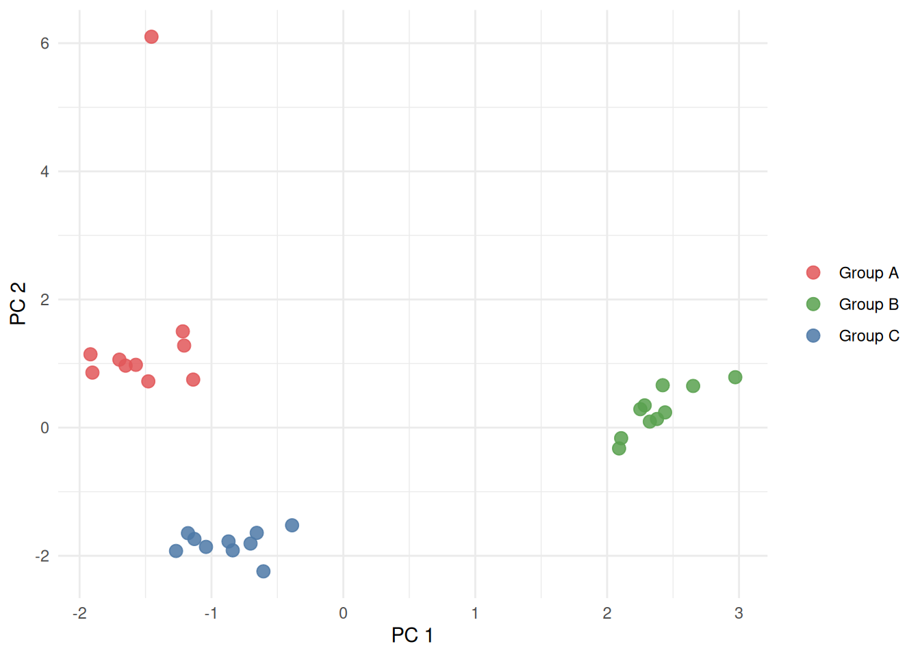
In many cases, these two approaches end up producing very similar-looking plots — “the view that shows the most variation” and “the layout that best preserves how different everything is” often point to the same picture.
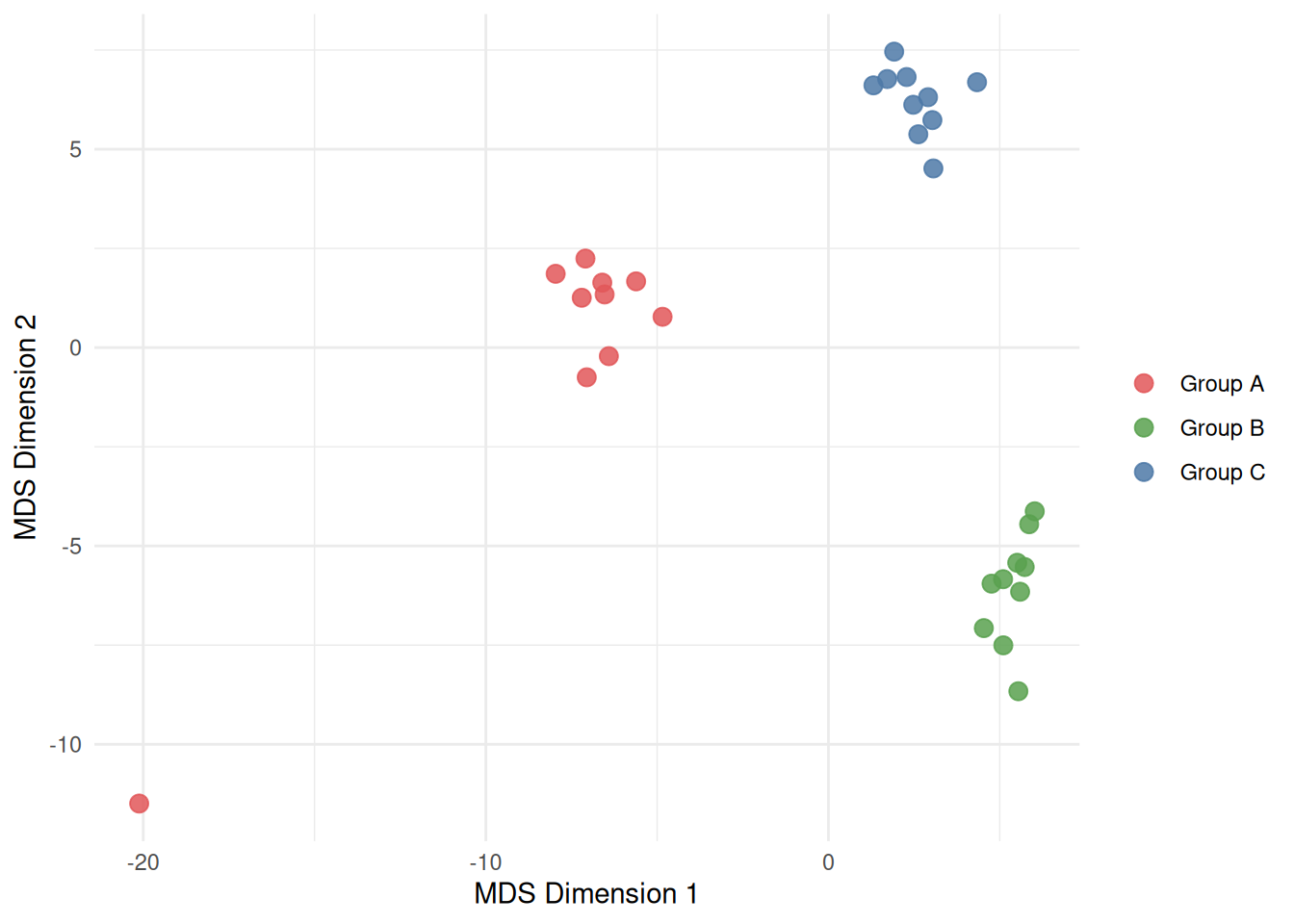
Here’s that similarity in practice. The toy data below isn’t two-dimensional to begin with — each of the 30 samples has 8 separate measurements, impossible to plot directly. The same 8-measurement data was handed to both PCA and MDS independently, with no coordination between them:
What to Look Fot
- Clusters — groups of dots sitting close together are samples that look broadly alike across everything measured.
- A dot sitting off on its own — an outlier, worth a second look. It might be a data quality issue, or it might be genuinely unusual.
- Two groups separating cleanly along one direction — a real, dominant difference between them, worth asking what drove it.
- Everything blending into one shapeless cloud — no strong pattern in what was measured, at least not one big enough to show up this way.
Reuse
Citation
For attribution, please cite this work as:
Barrantes-Reynolds, Ramiro. 2026. “PCA and MDS.” September
9. https://ramirobarrantes.com/blog/2026-09-09-pca-mds-for-clients/.